Product Analysis - Wikiloc
Review of Wikiloc: Features, Usability, and Growth Opportunities
Wikiloc is an application I regularly use to follow hiking trails, one of my favorite outdoor activities. After extensive use, I analyzed its functionality to identify opportunities for improvement.
To do this, I examined its overall strategy, evaluated the business model, and conducted a detailed review of all screens across both the desktop and mobile app versions.
What is Wikiloc?
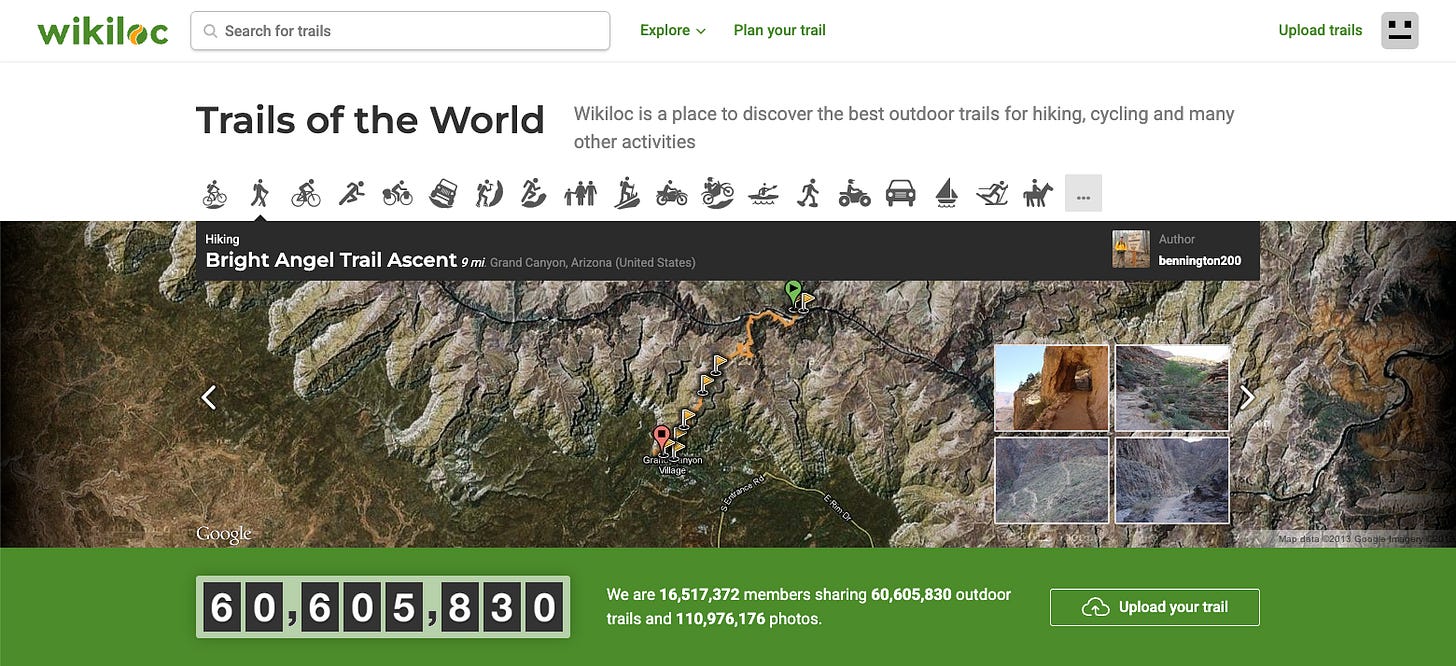
Wikiloc is a digital platform that enables users to discover, plan, and share outdoor trails for activities such as hiking, cycling, and running. Founded in 2006 by Jordi Ramot, it has 16 million users and offers 60 million trails as of January 2025.
In June 2023, the investment fund Miura Partners acquired a 40% stake in the company (the sale price was not disclosed). According to The New Barcelona Post, Wikiloc generated €5 million in revenue in 2021 and has reportedly increased this figure since then.
Business Model
Wikiloc operates on a freemium model. The app is free to use, but access to certain features requires an annual subscription of €9.99 (increased to €19.99 in 2024). Key features locked behind the paywall include downloading trails, sending maps to smartwatches, and searching for trails that pass through a specific point rather than just starting there.
In 2021, Wikiloc had approximately 9 million users, with about 5.5% (around 500,000 users) subscribing to the premium version. This is a modest percentage, given the low subscription price and the app’s numerous prompts encouraging upgrades. Considering the current user base of 16 million, it’s plausible that their annual revenue has surpassed €10 million.
In 2021, Wikiloc reported a net profit of €2 million, demonstrating that it is a profitable and scalable business. Source: Xataka
Wikiloc has also sought to diversify its income sources, although these likely represent a small portion of total revenue:
Route Promotion for Organizations: Organizations can promote their trails for an annual fee of €120. As of now, nearly 300 organizations use this service. More details here.
Business Promotion: Businesses can promote their services on the platform for €30.19 per year. More details here.
Strategy
Mission. Wikiloc’s mission is defined as: Trails of the World—a platform to discover and share the best outdoor trails for hiking, cycling, and many other activities.
Metrics. Throughout most communications and even on the website, there is a focus on the number of members, trails, and photos. These are classic vanity metrics, numbers that may appear significant but don’t necessarily indicate real value or engagement.
While users and trails are relevant, they do not necessarily reflect a strong growth strategy. Not all users contribute equally, nor do all trails add the same value to the community.
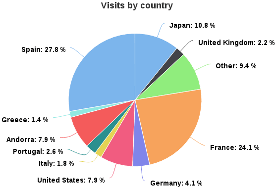
Acquisition. According to their data, 60% of users are from Spain, France, and Andorra. Given the platform’s scale, it’s surprising that it remains so geographically concentrated. Even more unexpected is that 10% of users are from Japan.
Marketing. On Instagram, with 73k followers, they occasionally post detailed trails in multiple languages, offering a wealth of information for their audience. On Twitter, with 7k followers, they share different types of content, though less frequently.
Additionally, they manage Wikiloc Planet, a dedicated portal featuring inspiring articles about the planet, the world of outdoor adventures, and Wikiloc itself.
Web & App Flows
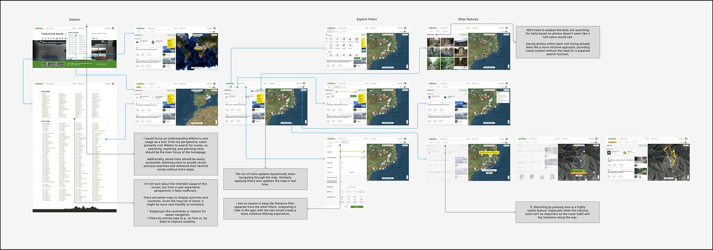
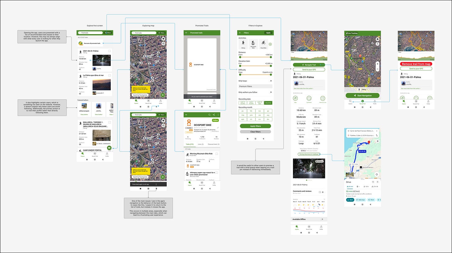
I analyzed Wikiloc’s website and mobile app in January 2025, using Android v3.45.9.
Your experience may vary depending on your platform and device.
Product Analysis - Wikiloc in Figma
Main features
Top 10 most important features of Wikiloc:
Explore and Search: Wikiloc allows users to discover trails by searching through an extensive database of hiking, cycling, and outdoor trails worldwide. Users can apply filters based on location, difficulty, or activity type to find the most relevant trails.
Search by passing area: Allows users to find trails based on specific waypoints or locations they want to pass through, rather than just a starting point.
Plan Your Trail: Users can create custom trails by selecting waypoints and mapping out a new trail
Lists of Trails: Users can create and save collections of trails, organizing them by theme, location, or personal preferences.
3D Map: Provides a three-dimensional visualization of trails, allowing users to explore terrain, elevation changes, and landscapes with a more immersive perspective.
Navigate Trail: A GPS-guided navigation feature that helps users follow a selected trail in real-time. It provides turn-by-turn directions and alerts to keep users on track while hiking. It includes an offline version.
Live Tracking: A real-time tracking feature that allows users to share their location with others while on a trail. This adds an element of safety and social interaction.
Upload Trail: Users can record and upload their trails using smartphones, smartwatches, or by manually uploading GPS tracks. They can also add photos, descriptions, and recommendations, contributing to the community and helping others discover new trails.
TrailRank: A quality score for Wikiloc trails, ranging from 0 to 50 (or up to 100 with high community ratings). While the formula is undisclosed, detailed descriptions, accurate GPS tracks, photos, and positive interactions improve it. A higher TrailRank boosts trail visibility in search results and map views, helping users find the best trails.
UserRank: A recognition of user contributions, based on trail quality, engagement, and activity. It appears on profiles, trail pages, and search results. Factors influencing UserRank include a complete profile, follower count, high TrailRank trails, and active participation through comments and ratings.
Product Recommendations
First and foremost, I want to clarify that I love Wikiloc. I believe they’ve done an outstanding job with limited resources, delivering a high-quality product.
That said, like any product, there’s always room for improvement, and my goal is simply to contribute my perspective. Of course, I don’t have the same insights as the team working behind the scenes, so some of my suggestions may have already been considered, or there may be valid reasons why certain aspects of the app function as they do.
The company's vision should be to establish itself as a leading reference for outdoor trails. Their strategy should prioritize expanding the user base that derives value from the platform while also increasing the percentage of paying users.
I wouldn’t focus on adding more trails, but rather on improving their quality. For users, having a few thousand more or fewer options per destination doesn’t add significant value. What truly matters is ensuring that the best trails are well-curated, accurately detailed, and easy to find.
1. Increase Fees
Update: Since July 2024, the price for new subscribers is already set at €19.99. Great to see Wikiloc taking on this challenging decision. This isn’t just about increasing revenue, but about ensuring that Wikiloc remains competitive, continues to develop great features, and leverages the best technology.
The annual fee of €9.99 is incredibly affordable. For context, comparable platforms charge significantly more:
Strava: €49.99 per year
AllTrails: €19.99 per year
Komoot: €29.99 per year
Outdooractive: Offers monthly plans at €2.50 and €5.00
Given these price points, Wikiloc has room to adjust its pricing while remaining competitive, especially considering the value it provides. I suggest increasing the annual fee to €19.99.
2. Focus on Paid Conversion
I haven’t been able to fully explore the app without a paid subscription, but I remember seeing several call-to-action prompts encouraging users to upgrade.
If the estimated 5% of users are paying users (as previously discussed), Wikiloc faces a significant challenge in increasing its revenue.
To address this, I would consider:
Placing more features behind the paywall to increase the perceived value of the premium plan.
Running campaigns offering a free first month to encourage users to experience the benefits. Once users subscribe to the premium plan, they are likely to remain subscribed, and a free trial period could help them experience the benefits and recognize the value of being a paying member.
3. Move to Validated Trails
Having the same trail duplicated multiple times doesn’t add much value. Instead, a well-defined, high-quality trail contributes far more to the community.
While TrailRank offers some guidance, I would suggest implementing an official validation process for certain trails to improve credibility and usability, similar to Twitter’s blue check mark for verified accounts.
The New Zealand government creates dedicated pages for its most famous hikes, such as the Routeburn Track (DOC New Zealand). I envision Wikiloc curating and validating popular and official trails, ensuring users can easily find trusted, high-quality routes.
4. Follow Trails instead of creating new ones
Along the same lines, I find it much more useful to see how many users have followed a specific trail, their completion times, and their ratings, rather than having the same trail duplicated hundreds of times.
Before recording a new trail, users should have the option to follow an existing trail (without creating another one after) or create their own version.
These actions may reduce the overall number of trails, but they will significantly improve quality and benefit the community. Given Wikiloc’s current volume of trails, prioritizing quality over quantity would be a much more valuable approach.
5. Trail Details Revamp
Given the importance of the trail details page, the amount of information displayed, and its current structure, there is a clear opportunity to improve the hierarchy of content and enhance usability.
Introducing subtabs could significantly improve the user experience by allowing users to switch between different sections, such as comments, photos, and ratings, without feeling overwhelmed by excessive information.
While saving trails is already possible, making "Save to List" a more prominent call-to-action would encourage users to organize their favorite routes more effectively. This action is likely to have greater value and frequency of use than downloading the trail or sending it to a GPS device.
Currently, when a trail is created, its difficulty is automatically set to "Moderate" by default. As a result, many users leave it unchanged, making it difficult to determine whether a trail is actually moderate or if the default value was simply never modified. This reduces the reliability of the difficulty rating, which is already a highly subjective metric.
A possible solution would be to leave the difficulty field empty by default, requiring users to actively select a rating. For verified trails, implementing a standardized difficulty rating system could further improve accuracy and consistency.
6. Home in Desktop and App
The Home screen is the user's first interaction with our product and a key opportunity to guide them toward relevant actions while introducing them to our platform.
On Desktop, the Home screen is the same for all users, whether logged in or not. It includes information about premium or organization plans, even though at that point, we already know who the user is. It also fails to remember saved trails, which could be highly valuable, and does not display personalized recommendations based on the user's location.
On the App, users are taken directly to the Explore tab based on their location. However, it also misses the opportunity to highlight saved trails, which could enhance user engagement.
On neither platform are recent activities, user stats, or User Rank mentioned, elements that could encourage users to take specific actions. Additionally, information from Wikiloc Planet is absent from the Home screen.
I would reconsider this first interaction and design an engaging Home experience across all platforms.
This would also help address one of the app’s main navigation issues. A key problem is the back button behavior, which closes the app when users expect it to return to the previous screen instead.
This issue is particularly noticeable when navigating between the main tabs, creating a frustrating experience. Improving this navigation flow would make the app more intuitive and aligned with user expectations.
7. Gamification in User and Trails Ranks
There is a lack of information and gamification around UserRank and TrailRank. This appears to be more of a communication issue rather than a feature limitation. A clearer explanation of these concepts could boost user engagement and encourage participation.
I would take inspiration from Strava’s ranking system, including PRs (Personal Records) and Local Legend features, to make the experience more interactive and action-driven.
To improve UserRank, I would introduce specific actions users can take to increase their ranking. Instead of having a huge number-based ranking (e.g., I have 57, but I’ve seen users with 20,912), a scaled ranking from 1 to 100 would make it more understandable and actionable.
For TrailRank, which is already capped at 100, there is no clear guidance on how to improve it. Providing specific actions that influence TrailRank would help users understand how to enhance their contributions. When searching, trails with a high TrailRank are given priority in the results. I’d like to see the same logic applied to user navigation, ensuring that their best trails are more easily discoverable in their profiles.
8. Unified Content Strategy
The Instagram account, Twitter account, and Wikiloc Planet each publish different content. Aligning content here could improve user engagement and reinforce key messages.
It’s also worth evaluating whether it makes sense to maintain a Twitter profile given the low engagement.
Additionally, creating SEO-optimized content on Wikiloc Planet could enhance search engine visibility and attract more organic traffic. I like the content that Much Better Adventures publishes.
Final Thoughts
Wikiloc is an impressive platform that has successfully built a strong community around outdoor activities. With a profitable and scalable business model, it has positioned itself as a leading resource for discovering and sharing trails.
They’ve probably already done the hardest part. Now, like any product, there are opportunities to refine the experience and make it even more valuable for users. Wikiloc could improve its platform by focusing on trail quality, discoverability, and navigation. Features like trail validation, better ranking systems, a more dynamic home screen, and enhanced gamification for ranks could have a significant impact.
The goal should be more than just to grow, but to grow meaningfully, ensuring the best trails are well-curated, easy to find, and truly valuable for users.
Additional Resources
I liked the last article, which highlights the risk of assuming everyone is adequately prepared for certain trails. Understanding the difficulty level, the physical demands, and the technical skills required before attempting a trail is essential.
Wikiloc could take on some responsibility in raising awareness among users, helping them consider these factors before setting out. This could include understanding each user's experience level or highlighting seasonal variations, such as how trail difficulty and required equipment can change between summer and winter.


I agree totally with suggestion #3. Having many different trails makes it difficult to choose one, the right one.
On the other hand, you may see changes over time, or differences according to when the trail was recorded. Maybe a "canon", with the different variations associated to it, would be a solution.
Also, prominent waypoints or features are highlighted on the map, even if they are in the trail you are following. I guess they are collected from different trails if several of them include them.
I also don't feel comfortable with the app interface. If I'm following (and recording) a trail and want to check the trail I'm following, it's not that obvious.